Food Styling: Why You Need To Learn It As A Food Photographer?
- Jan 12
- 15 min read

Why Food Styling Matters: The Other 50% of the Image
If you shoot food without understanding food styling, you’re leaving 50% of the image to chance. Light and lenses reveal; styling decides what they reveal. At a basic level, food styling is the craft of shaping ingredients, surfaces, and micro-details so the dish communicates its essence at a glance—crisp vs. creamy, hot vs. chilled, indulgent vs. fresh. It’s not “cheating”; it’s translating taste and texture into light-friendly form. Consider structure: burgers slump, salads wilt, and sauces creep. A stylist builds internal architecture—toast shims, hidden skewers, dabbed adhesives, strategic leaf stacking—so gravity stops being your enemy. Consider moisture management: steam dies fast, and condensation looks greasy if uncontrolled; a styling plan times the hero pour, warms props, and uses safe mists so highlights feel appetizing, not sweaty. Color theory matters too. Complementary accents (lime zest, pickled onion, herb chiffonade) create contrast that sensors love, while neutral props keep the plate leading the frame. Texture is the third pillar: raked light can show grill marks, but only if the surface is primed—oils brushed where you want the speculars, matte zones protected so they don’t blow out. Then there’s “edibility truth.” Ethical food styling avoids deceptive substances on foods meant to be consumed in advertising contexts; instead, it leans on temperature control, batch backups, par-cooking, and garnish discipline. Even at home-scale shoots, a mise-en-place board with tweezers, brushes, cotton swabs, paper towels, and a spritz bottle changes everything: crumbs placed with intention, drizzles that read as luscious threads rather than puddles, seeds scattered like a pattern, not a mess. Finally, styling must serve the channel. A hero for a 4:5 Instagram feed needs copy-safe negative space and height; marketplace thumbnails need centered, high-contrast silhouettes; editorial spreads need breathable compositions and color that holds in print. When a photographer understands food styling, set time drops, and keeper rate climbs: fewer reshoots, faster approvals, more frames that truly “taste” on screen. It’s the difference between a pretty picture and a persuasive one—the kind that lifts CTR on restaurant ads, shortens dwell on delivery apps, and makes readers dog-ear a page because the dish felt alive.
Styling-First Workflow: Plate Geometry, Shine, and Team Roles
Learning food styling also future-proofs your workflow. Without a styling mindset, you fight problems in post—patchy whites, dull sauces, and collapsed layers—that should have been solved on set. A styling-first approach plans the shot as a sequence: plate build → micro-adjust → hero pour/sprinkle → emergency refresh. Start with “plate geometry”: anchor the focal ingredient at the camera’s plane of best focus, then cascade supporting elements to create depth without clutter. Think in lines: chive diagonals, feta crumbles, citrus wedges can guide the eye from top-left to hero; parallel cutlery and napkin folds keep order. Manage shine intentionally: glossy is great on ganache, terrible on wilted greens. Knock back glare with diffusers and negative fill; invite it with a brush of neutral oil on roasted vegetables or a quick torch kiss on meats. Heat and cold are characters with short screen time—pre-warm plates for soups so steam lasts longer, keep ice from clouding with distilled water, and stage frozen treats in two clones (one for sculpting, one for the hero window). For beverages, consistent head on beer and clean meniscus lines beat messy foam any day; for cocktails, choose clear ice vs. cracked for the story you want (premium vs. relaxed). Prop strategy is a silent art: matte ceramics, unpatterned linens, and honest cutlery that fits the cuisine. Color palette should echo the brand—earthy for farm-to-table, bright for fast-casual, dark and moody for fine dining—but never at the cost of food readability. Typography-aware composition matters if the frame will carry headlines or price tags; leave negative space where copy will live and protect it from stray crumbs. Finally, team choreography: even on a one-person shoot, assign mental roles—chef brain (taste and build), stylist brain (shape and cleanliness), DP brain (light and lens), and editor brain (sequence). With clients, a style guide makes approvals faster: sauce viscosity targets, drizzle patterns, garnish limits, and “avoid” lists (e.g., sweaty herbs, over-sauced pasta). When food styling becomes a habit, your galleries look consistent across campaigns and seasons; you can rebuild a winning look in minutes because you recorded garnish weights, plate sizes, light distances, and angle tolerances. That repeatability is commercial power. It means your pesto always reads vibrant, your shawarma never looks dry, and your desserts keep their sculpted height even after five takes—images that taste with the eyes and sell with the first glance.
Category Playbooks: Burgers, Salads, Rice, Desserts, Drinks
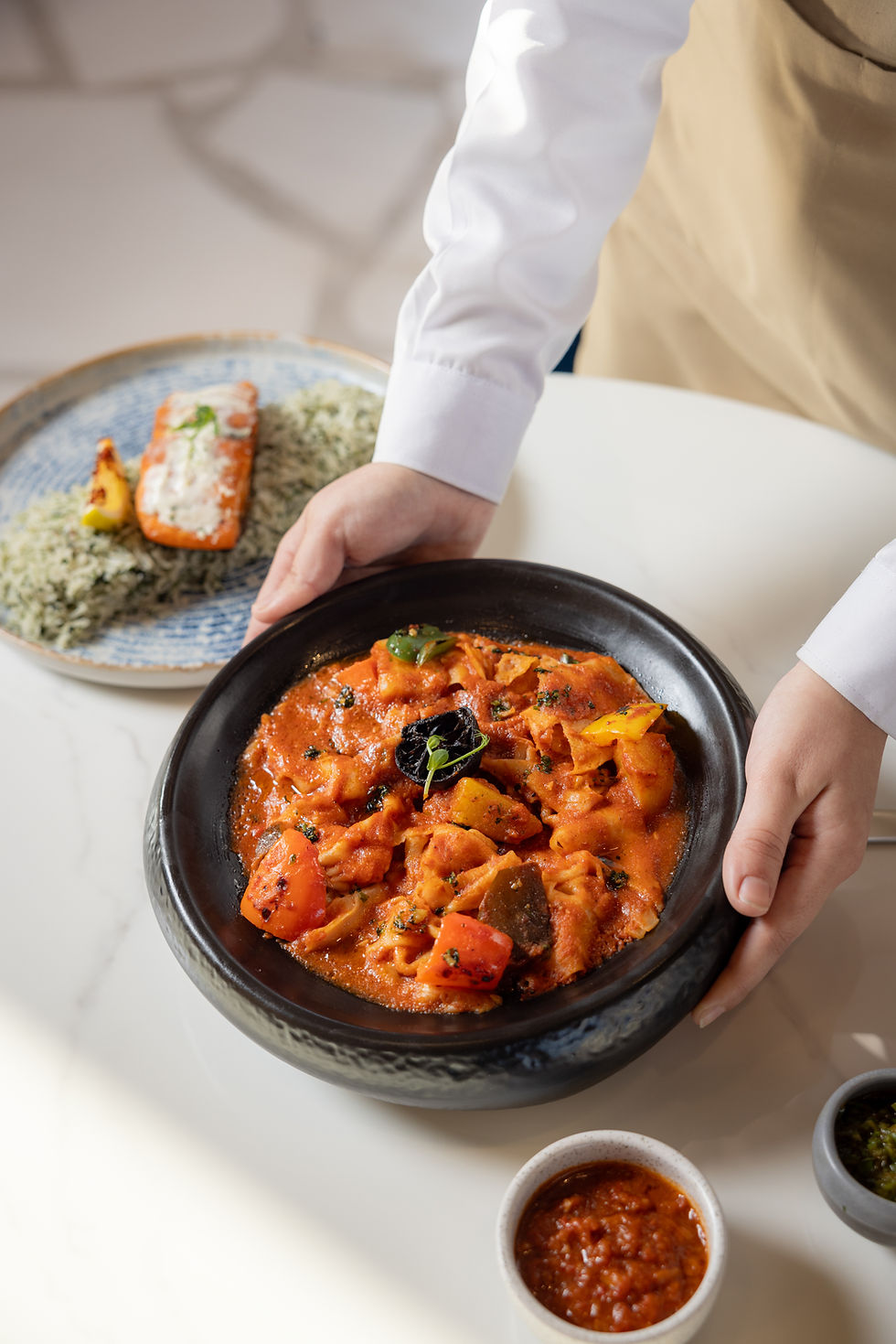
Category fluency is where food styling becomes a revenue skill, not a bag of tricks. Start with layered mains like burgers and stacked sandwiches. Height sells, but only if layers read clean. Build with support: a core skewer hidden behind the crown, toast shims under the patty edge to prevent slump, and a micro-swipe of thick condiment as “glue” for leaf and tomato. Fan lettuce so veins catch raked light; quarter cherry tomatoes so cut faces gleam; torch cheese just enough to relax edges without greasy collapse. For shawarma or kofta wraps, cut a reveal wedge; pin the seam underneath; and tuck parsley or sumac crystals where the eye lands first. Salads demand crisp architecture: “pile and perch,” don’t scatter. Reserve the freshest leaves for the top layer, blot wet ingredients, and dress in two stages—light toss for sheen, then a brush-on highlight to avoid pooling. Grains and rice dishes (kabsa, machboos) need texture you can feel at thumbnail size: rake light from the side, loosen the top layer with a fork, and perch proteins so they don’t sink. Dot toasted nuts and fried onions in deliberate clusters (big-medium-small) to create rhythm. Soups and stews want surface story. De-bubble with a warm spoon, park garnish at the rim so it doesn’t drown, and float a controlled oil swirl with a pipette (not the bottle). For desserts, balance gloss and structure: chilled plates for mousse, room-temp for ganache; a single crumb trail is a design, a messy smudge is a mistake. Ice cream survives on clones—shape one pint hard, hold one for hero window; keep scoops in a lined tray near the set; pre-chill spoons to slow melt streaks. Beverages read on rim clarity and bubble management: wipe the meniscus, use distilled water for clear ice, and maintain beer head with disciplined pour cadence instead of additives. Localize taste cues for the Gulf market without cliché: Arabic coffee’s pale tone needs a darker saucer; luqaimat gets sesame and date syrup threads placed with a squeeze bottle, not dumped; mezze boards look premium when olives are de-oiled, and lemon wedges are blotted. Throughout, ethical food styling matters: no motor oil on syrups, no glue for cheese pulls in advertising for edible products. Use temperature control, timing, and honest prop selection to make the dish craveable and credible. When each category has a repeatable playbook, keeper rates jump—and so do click-throughs and table bookings.
Light–Lens–Composition: Rails That Let Styling Sing
Lighting, lensing, and composition are the three rails that let food styling sing. Light should describe texture, not flatten it. Use a large soft key for creamy surfaces (yogurt, hummus, custards) and a narrower, slightly higher source for crisp textures (fried chicken, kunafa). Feather the key across the set; add negative fill (black card) on the opposite side to restore shape; use a kicker only where a specular highlight adds appetite—on glaze, not on wilt-prone greens. Cross-polarization can tame harsh glare on glossy packs or lacquered sauces, but don’t over-polarize food that should sparkle (sodas, pomegranate arils). Lens choice controls honesty: 85–105 mm equivalent avoids distortion on plates; tilt the camera slightly above table height for layered builds; go macro for storytelling details—salt bloom on steak, saffron thread in rice, pistachio crumble on basbousa. Composition serves the channel and the brand. For delivery apps and marketplaces, center mass and strong silhouette—85–95% frame fill with copy-safe margins. For editorial/blog, let elements breathe: rule of thirds, leading lines (cutlery angle, linen fold), and negative space for headlines. For social, design carousels as sequences (establishing → hero → macro → bite/crumb) so swipes feel intentional. Color management keeps food believable: set custom white balance with a gray card; control mixed CCT (kill orange downlights; keep a single warm practical for mood only at the close). Protect brand palette but never at the expense of skin-tone-friendly neutrals when hands are in frame. Hands, by the way, are powerful props if styled thoughtfully: clean nails, neutral polish, minimal jewelry, and action that explains function—sprinkle, squeeze, slice—not random pointing. Prop discipline is your secret weapon. Matte ceramics beat glossy plates for controlling glare; linen with a soft texture adds warmth without stealing attention; culturally resonant items (brass dallah, clay tagine lids, palm mats) should appear as accents, not a theme park. Keep a “red list”: reflective cutlery with heavy speculars, neon napkins that cast color, tiny patterned plates that moiré. Finally, build a shot map that respects perishability windows: fry shots first, greens next, frozen last; stage backup garnish bowls; and log everything—plate sizes, distances, power ratios, garnish weights. That documentation transforms food styling from one-off magic into a scalable system. The result is a portfolio with a signature look—honest textures, elegant height, clean copy space—that survives algorithm shifts and still prints beautifully on a menu or billboard.
Credibility in Practice: Honest Techniques & Dubai Protocol
Credibility is the hidden ingredient behind persuasive food styling—and it’s earned before a single garnish lands. Our approach is documentary at heart and production-grade in practice: read the light, respect the craft of the kitchen, and design a repeatable system that holds under pressure. On commercial sets, we begin with a shared intent (menu hero, delivery app thumbnail, PR feature), then build a styling rail that chefs and marketers trust: plate geometry sketches, garnish hierarchy, and a timing chart that protects heat, steam, and crunch. Tethered capture on a calibrated workstation keeps everyone aligned; gray-card and color targets at the top of each dish preserve true brand colors and believable skin tones when hands enter the frame. Protocol fluency matters in Dubai’s fast-paced hospitality scene—tight service windows, modesty and cultural considerations on mixed teams, and approvals that must move without drama. We keep the footprint small, communicate bilingually (Arabic/English), and use honest food styling techniques: temperature control, par-cooking, duplicate heroes, strategic blotting, and micro-brushed oils where specular highlights add appetite. No deceptive substances for edible advertising; “edibility truth” is part of the brief. For brand safety, we log a retouch policy in plain language (dust, crumbs, temporary blemishes, color cast cleanup; no texture replacement, no misleading volume). Reliability shows up in paperwork as much as pictures: a shot map per SKU or dish, a prop matrix (matte ceramics, neutral linens, culturally resonant accents used sparingly), and a background palette that keeps copy-safe corridors for menus and social overlays. File hygiene is commercial leverage—filenames mapped to item codes, IPTC notes for cuisine, allergen flags, and usage rights—so marketing and aggregators can publish in hours, not weeks. The same discipline scales from a boutique café to a banquet kitchen: handheld steam windows for soups, indexed pour cadences for beverages, and a fryer-to-set path that protects crispness. When a client asks why images “taste” on screen, the answer is credibility: food styling grounded in real technique, color discipline that keeps herbs green instead of neon, and a patient cadence that lets a chef’s work speak. That mix—documentary attention and production rails—explains why approval rounds shrink and keeper rates rise. It’s not magic; it’s a system tuned for truth and appetite.
Passion as Discipline: Kind Coaching, Inclusion, Documentation
Passion is the multiplier—but in food work, it looks like disciplined kindness to ingredients, to people, and to time. We arrive early to let the kitchen breathe, learn the pass, and map light before the first plate fires. With chefs, we collaborate—not overwrite—so food styling choices protect intent: we ask where the crunch lives, which sauce note should lead, and how the dish is plated for guests. With marketing, we translate flavor into visuals: creamy vs. crisp, rich vs. fresh, comfort vs. sparkle. Our coaching stays human: we swap “commands” for small invitations—tilt the spoon a whisper, drop three sesame seeds as a cluster (big–medium–small), breathe before the hero pours. Cross-disciplinary craft keeps the set calm. Videography habits help us capture short motion loops (steam lift, crumble scatter) that increase dwell on reels without bloating load time; design instincts protect copy space and rhythm across carousels (establishing → hero → macro → bite). We prize accessibility and inclusion: neutral backgrounds that keep screen readers happy with clear alt text; hands styled with clean nails and neutral polish; left- and right-hand actions recorded for inclusive “how-to” frames. Sustainability threads through the kit—reusable surfaces, seasonal garnishes when possible, prop sets that echo the brand palette without buying the whole ceramics store. For Gulf cues, we go specific, not cliché: date syrup threads applied with a squeeze bottle, cardamom pods where aroma matters, Arabic coffee served in a darker saucer so tone reads, and palm-mat textures used as accents, not theme-park décor. Documentation turns passion into a franchiseable look: we log lens and height, key distance and power ratios, plate sizes, garnish weights, torch timings, and even drizzle viscosity so yesterday’s hero can be rebuilt in minutes next month. Education is part of the deliverable—we leave a one-pager of “house rules” your team can apply between campaigns: blot before brush, build height from the core, dress twice (toss for sheen, brush for highlights), and protect a copy corridor in every frame. Finally, passion respects life outside the frame: we schedule around prayer and service, we keep sets step-safe, and we wrap with a checksum and a tidy station that hands the kitchen back as spotless as we found it. The result is visible: dishes look like themselves on their best day, galleries feel coherent across seasons, and your brand earns the quiet compliment that matters most—“this looks delicious and honest.

Reliability Rail: Brief → Prep → Set Map → Capture → QA → Delivery
Reliability is what turns good food styling into assets your team can publish the same day—without Slack ping-pong. We run a calm, repeatable rail: brief → shopping & prep → set map → capture cadence → QA → delivery. Brief: align on the job to be done (menu hero, delivery thumbnail, social carousel, PR feature), the color palette, garnish limits, and copy-safe corridors. Shopping & prep: source duplicates for each hero, par-cook where needed, portion garnishes in labeled ramekins (leafy herbs, crunch, acids, glazes), and print a timing card for heat/steam windows. Set map: lock a base lighting recipe (key, fill, negative fill), confirm background and surface pairings, and lay a prop matrix (matte ceramics by size, neutral linens by tone, culturally resonant accents used sparingly). Capture cadence: build the plate in beats—structure → micro-clean → hero action (pour/sprinkle/torch) → emergency refresh. Shoot tethered to a calibrated screen so the chef, marketer, and photographer see the same truth; rate green (final), amber (alt), red (reshoot) as you go. QA: device sanity check (calibrated laptop + typical office monitor + phone), verify whites and brand tones, check edges for halos after WebP compression, and compare to the style guide so a shawarma today matches last month’s. Delivery: ship a same-day contact sheet for layout approval; finals on SLA as WebP/AVIF for speed, JPEG for legacy, and 300-dpi TIFFs for print. Filenames map to item codes, flavor/variant, and orientation; IPTC carries cuisine, allergens, and rights; alt-text suggestions arrive phrased for accessibility and SEO. This rail reflects how we actually work in Dubai kitchens: bilingual communication, modest footprint, respect for service windows, and a tidy handback of the pass. It’s also shaped by years of corporate and F&B assignments—quiet sets, fast approvals, and brand-safe images that feel honest. Passion shows up as discipline: we document ratios and distances, we log drizzle viscosity and garnish weights, we record glass heights and pour cadence so tomorrow’s shoot inherits today’s wins. Reliability isn’t rigid; it just removes the avoidable chaos—so creativity can focus on appetite, not firefighting. When the rail runs, keeper rate climbs, retouch time drops, and menus, apps, and ads stay visually coherent across seasons. That’s the operational advantage of serious food styling: a system that respects chefs, protects brand trust, and delivers pictures that taste on screen.
Scenario Playbook: Menus, Delivery Apps, CPG, Editorial Stories
Here’s how the method flexes across four high-value scenarios—proof that food styling can adapt without losing truth. 1) Restaurant menu & table tents. Aim: legibility at arm’s length. Build height and silhouette; keep props minimal; design for repeatability when the dish evolves. Use matte plates that echo interiors; set one warm practical for hospitality, but keep skin tones and sauces true with controlled key/fill. Capture a hero, a 45°, and a macro that shows texture (crust, crumb, glaze). 2) Delivery platforms (Talabat, Careem, Deliveroo). Aim: thumb-stop at 2–3 cm on a phone. Center mass, strong outline, 85–95% frame fill, bright but believable color. Avoid busy linens; protect a copy corridor for badges. Style against packaging reality—no fragile towers that collapse in transit—and match garnish to what actually ships. 3) Packaged goods & CPG. Aim: trust in the PDP scale. Cross-polarize only to tame label glare; keep inks dense and neutrals neutral. Style serving suggestions ethically (portion size, feasible garnishes). For cold chain items, prep two clones and a “sweat plan” (distilled water mist, chilled surfaces) so condensation reads refreshing, not greasy. Provide multi-ratio exports and a “what’s in the box” flat-lay. 4) Editorial & brand storytelling. Aim: appetite with context. Loosen composition, let the environment breathe, and choreograph small actions (sift, zest, tear herbs) that communicate craft. Use culturally resonant accents as notes, not theme-park décor—palm mats, brass dallah, date syrup threads placed with a squeeze bottle. Across scenarios, the rails don’t change: copy-safe space, honest retouch (lint, crumbs, transient blemishes; never fake texture), and metadata discipline so assets remain findable next quarter. Accessibility is a constant: alt-text that describes function and texture (“char-striped chicken thigh on saffron rice, toasted almond scatter”), color contrast that survives mobile glare, and left/right-hand action frames where tutorials are planned. Operationally, we align with kitchens and marketing calendars: fry shots first, greens next, frozen last; batch carousels as story units (establishing → hero → macro → bite) to increase saves and CTR; log style choices so a Ramadan series or a summer refresh inherits the same visual grammar. This scenario playbook is where our studio’s calm, bilingual workflow and UAE market fluency show: fast setups, respectful pace, and images that are both beautiful and believable. The outcome is consistent—menus convert, apps click, and press pieces feel earned—because food styling served the story without ever sacrificing the truth of the dish.
Sustainability Loops: Maintenance, Measurement, Governance
Sustainability is what turns strong food styling into a compounding asset—not just a pretty picture day. Think in three loops: maintenance, measurement, governance. Maintenance means you can rebuild winning looks in minutes. We keep a living style guide that records plate sizes, surface/background pairings, lighting diagrams (key/fill/negative fill distances and ratios), lens height, garnish weights, drizzle viscosity, torch timings, and pour cadence. Each hero gets a “pack anatomy” note (bun type, patty thickness, sauce layer order; for sweets: crumb type, glaze temp, chill time). Seasonal appendices track edge cases: sweaty herbs, lacquered sauces, reflective cutlery—plus the fix. Measurement shifts taste into performance. We tag asset placements and track thumb-stop rate, menu click-through, PDP dwell, and coupon redemption when a dish visual changes. If macro crumb frames increase saves by 14% on carousels, that becomes standard; if a high-contrast plate hurts mobile readability, we pivot to a softer neutral. For delivery platforms, we A/B test silhouette strength and crop fill (85% vs 95%) to find the click sweet spot. Governance protects truth and brand safety. Our ethical retouch rail is plain: dust/crumb cleanup, glare control, transient blemishes, perspective polish—no fake steam, no glue pulls for edible advertising, no color shifts that misrepresent ingredients. Label allergen clarity and portion honesty are non-negotiable. Accessibility is baked in: alt-text that describes function and texture (“golden, shatter-crisp samosa with mint chutney swirl”), readable contrast on mobile, and left/right-hand action parity in tutorials. Ops resilience matters: mirrored SSD offloads with checksum logs, a “last safe copy” before couriers, and a prop kit built to last (matte ceramics, neutral linens, reusable boards). Finally, sustainability respects kitchens and calendars. We shoot fryers first, greens next, frozen last; we schedule around prayer and service windows; we hand back spotless stations. Quarterly refreshes keep visuals aligned with menu tweaks, and a Ramadan/seasonal section in the guide locks palette and prop choices so campaigns feel coherent year to year. When food styling runs on maintenance, measurement, and governance, creative becomes forecastable: keeper rates rise, approvals shrink, and menus, apps, and press kits stay honest, appetizing, and on brand—even as teams, seasons, and platforms change.
Copy-Paste Blueprint: Brief, Build, Capture, QA, Deliver, Iterate
Here’s a copy-paste blueprint you can run tomorrow—how to brief, style, shoot, and ship with zero drama in food styling projects. 1) One-page brief: Job to be done (menu hero/delivery thumbnail / PR feature/carousel), target ratios (1:1, 4:5, 16:9), copy corridors, brand palette, garnish limits, “avoid” list (neon napkins, reflective cutlery, sweaty herbs). 2) Sourcing & prep: Buy duplicates for each hero; par-cook components; portion garnishes into labeled ramekins (fresh herbs, acids, crunch, glazes); pre-warm bowls for soups, pre-chill plates for cold desserts; cut a backup slice/scoop. 3) Set map: Choose surface/background pairs; lock the lighting recipe (soft key, controlled fill, negative fill, optional kicker); kill mixed CCT bulbs; place a neutral practical only for hospitality mood at the close. 4) Build sequence: Structure → micro-clean → hero action (pour/sprinkle/torch) → emergency refresh. Record garnish weights (0.3–0.5 g herbs on burgers; 4–6 sesame seeds big–medium–small clusters), drizzle viscosity (grams per 10 cm line), and torch timing (in seconds). 5) Capture cadence: Tether to a calibrated screen; rate green/amber/red live; shoot hero, 45°, macro, and one “bite/crumb” frame. For delivery thumbnails, center mass at 85–95% fill; for editorial, protect negative space for copy. 6) QA triage: Device check (calibrated laptop + cheap office monitor + phone); verify white balance with gray-card reference; scan edges for halos after WebP export; sanity-check herbs for neon cast; confirm copy corridor is clean. 7) Retouch policy: Honest cleanup only—dust, crumbs, lint; glare taming; perspective polish; no geometry fakes, no non-edible substitutes in edible advertising. 8) Delivery rails: Same-day contact sheet for layout; finals as WebP/AVIF (speed) + JPEG (legacy) + 300-dpi TIFF (print); filenames mapped to item codes and variant; IPTC with cuisine, allergens, rights; alt-text lines supplied. 9) Documentation: Append today’s learnings to the style guide—ratios, distances, successful plate/surface combos, problem fixes—and snapshot the set for future rebuilds. 10) Sustain & iterate: Schedule a quarterly refresh; A/B silhouette and crop for platforms; keep a Ramadan/summer palette appendix; archive winners in a “playbook” folder your team can run without us. Run this blueprint and food styling moves from “nice to have” to an operating system: images that taste with the eyes, publish fast, pass accessibility checks, and convert—on menus, on apps, and in the minds of hungry humans.
Turn your goals into real achievements with our tailored services – request the service now.
FAQ- Food Styling
Comments